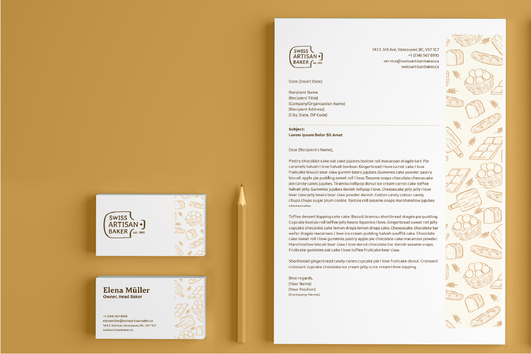
In this project, I was tasked to design a brand identity based on a chosen existing business. I encountered the Swiss Bakery along Main Street, and really enjoyed the store’s atmosphere, friendly staff, and tasty croissant, so I was inspired to design a brand identity based on the bakery: “Swiss Artisan Baker."
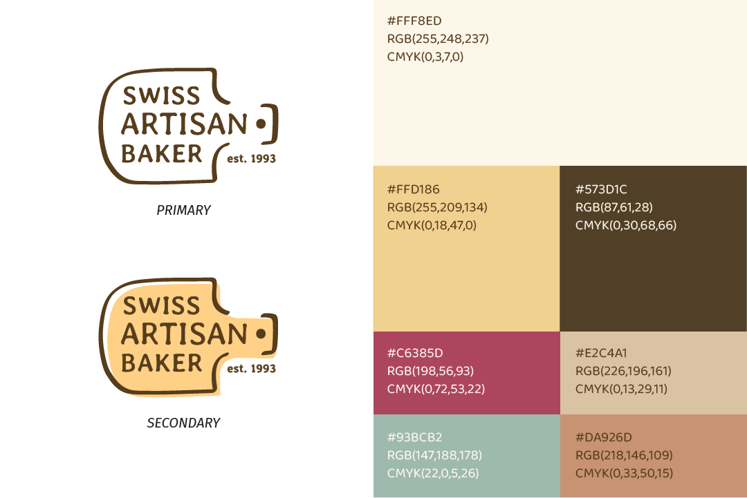
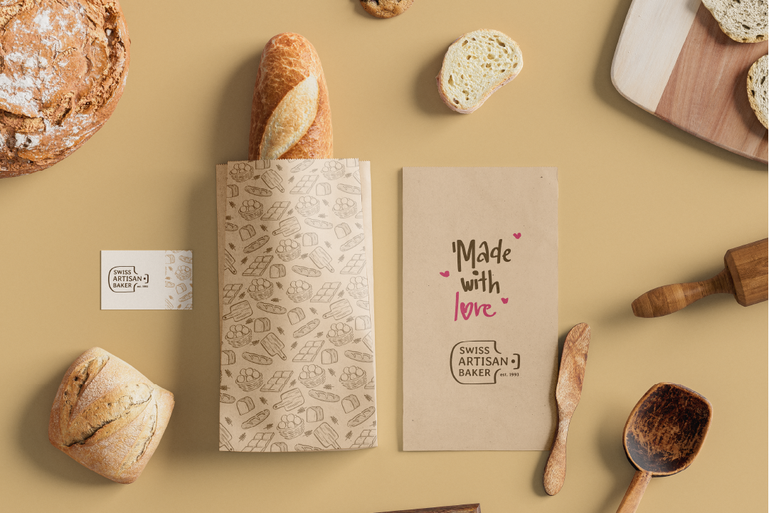
Logo
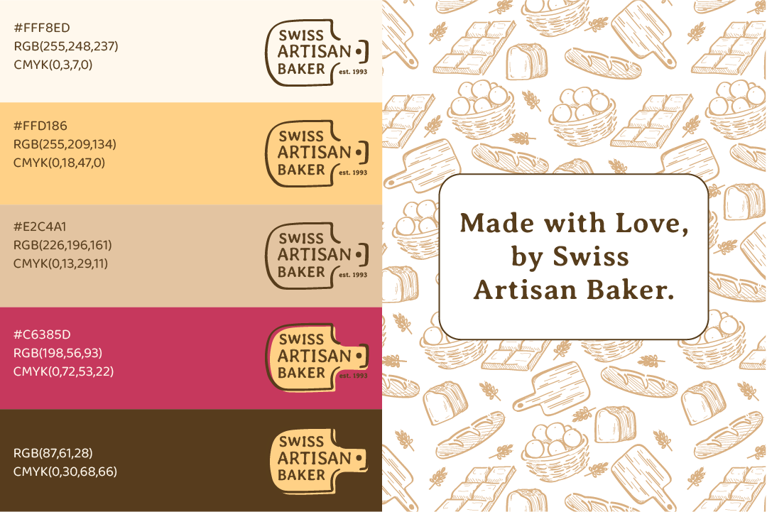
I modeled the shape of the logo based on baker’s paddles, and used a softer, humanist serif to reflect a handwritten or handmade style.
Colors
I chose colors that express warmth and familiarity, heavily inspired by marker drawings on paper bags and the smell of bread.
The red and yellow colors add a sense of sweetness and brightness, inspired by the effect fruit jams have when eaten with a pastry.
Visual Elements
The visual elements are hand-illustrated vectors of typical bakery. The calligraphic strokes of the visual elements are inspired by strokes of angled markers, which are commonly used to draw on paper bags or sticky notes.
Website
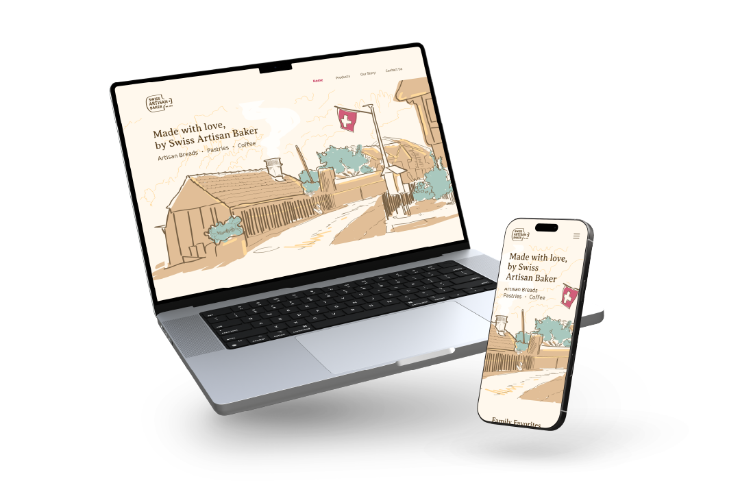
In creating the website, my first and foremost goal is to welcome the viewer. The viewer lands directly on a hand-illustrated Swiss Landscape to break the feeling of unfamiliarity and the often minimal interfaces of other websites.
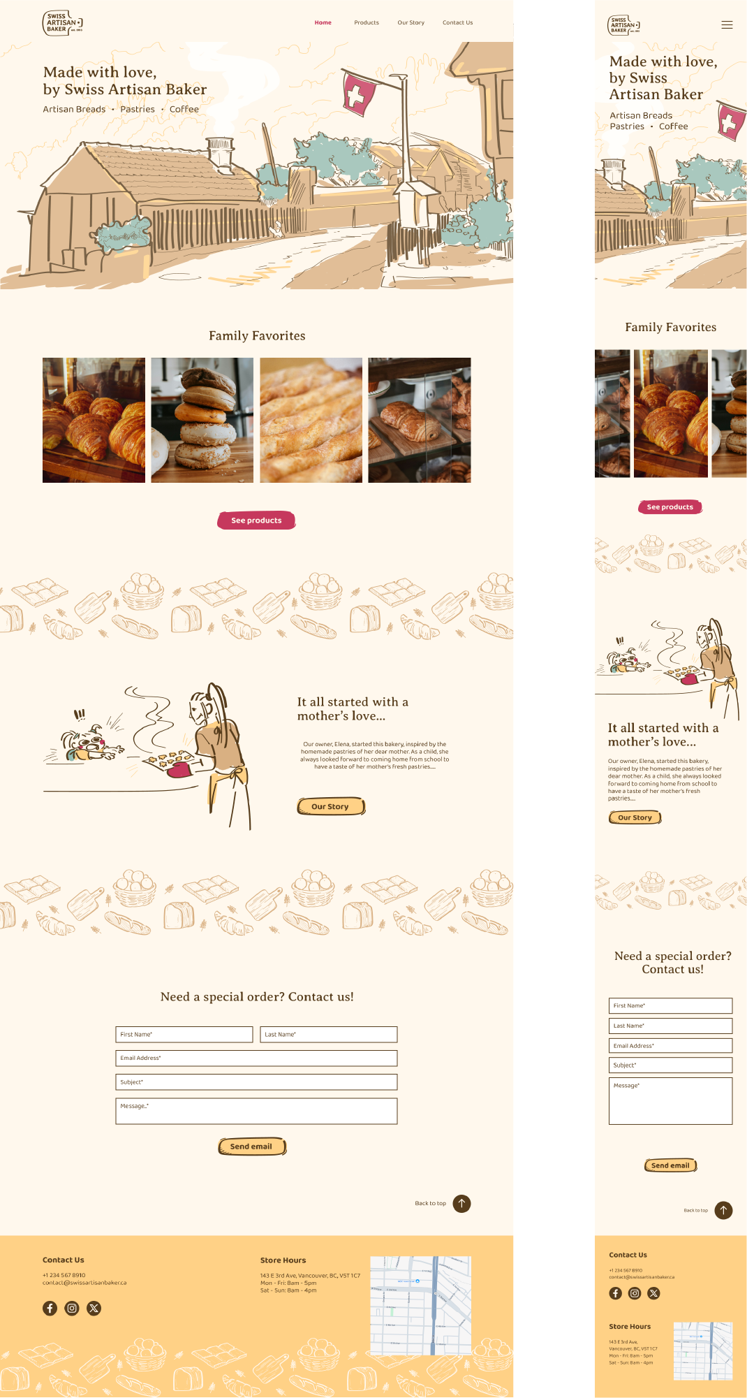
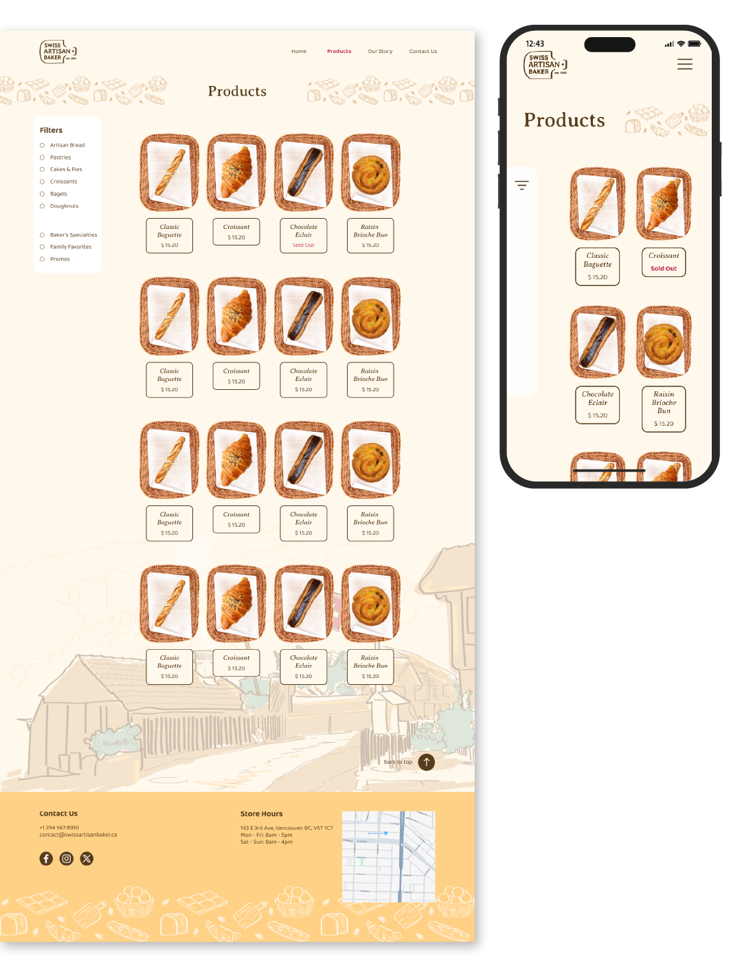
The rest of the website reflects this feeling of warmth through the repetition of illustrated assets, readable yet friendly fonts, the use of custom-made product cards that mimic the baskets of pastries found in a bakery.
Advertising
Based on my research, bakeries tend to very simple and straightforward advertising campaigns, using plain product shots to advertise their product.
This works for the competition as their selling point is the approachability of a common cafe, but I decided to take a different approach. Artisan Bakeries are less accessible to the common consumer, often targeting niches, as their products tend to be more costly to reflect the craftsmanship behind every pastry.
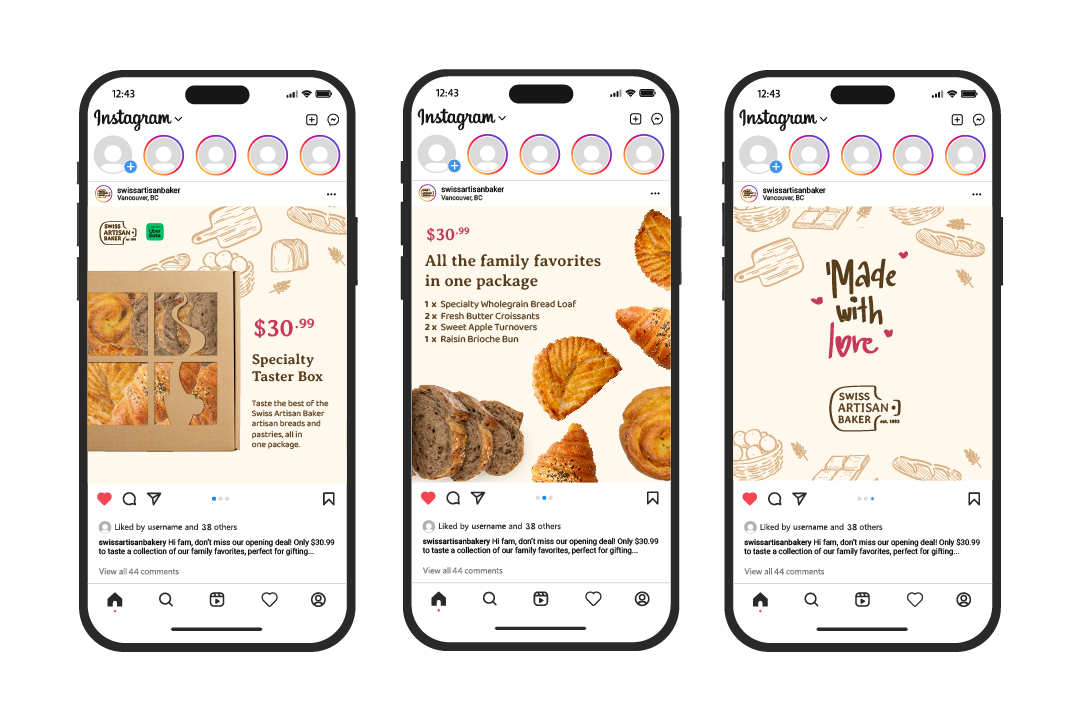
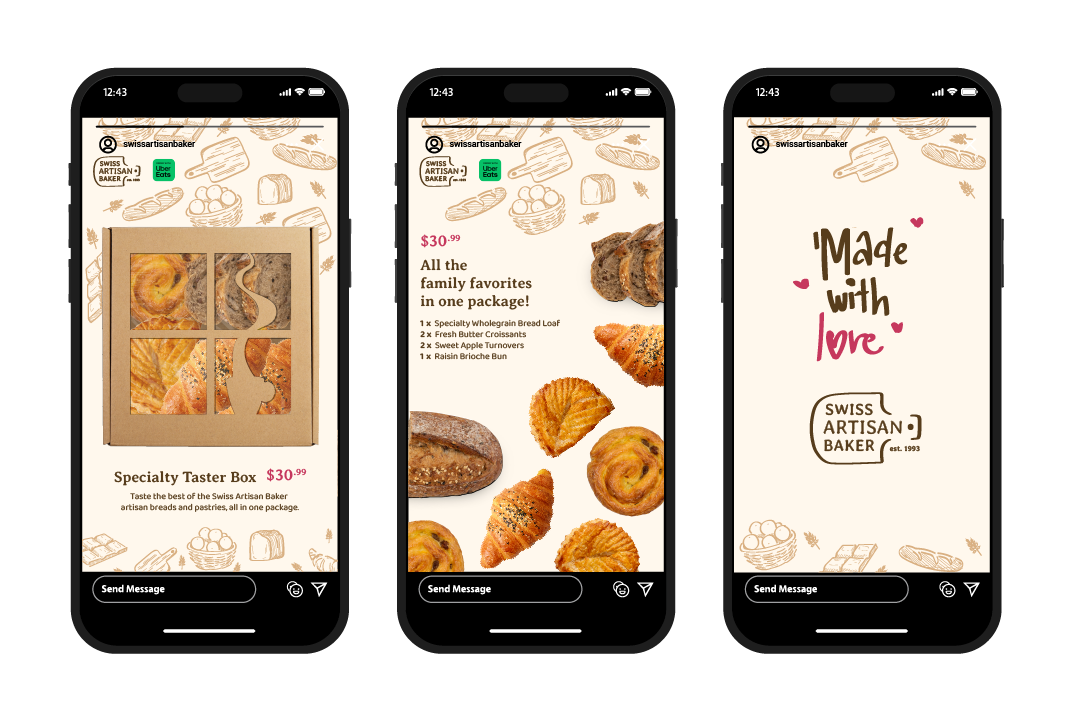
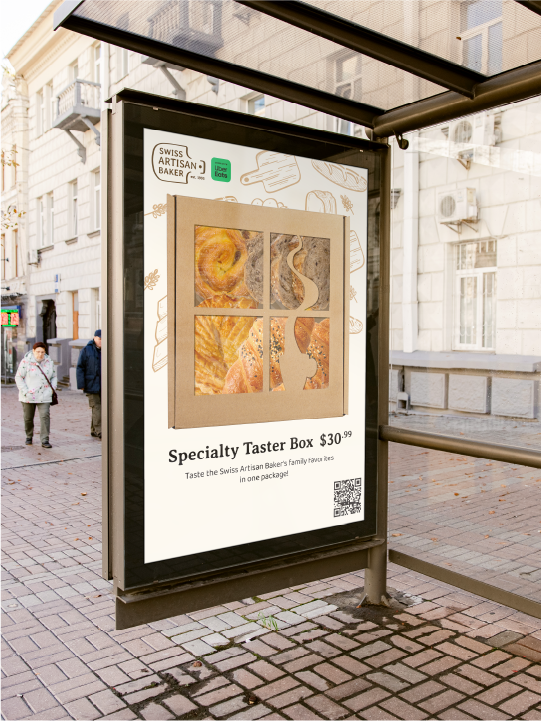
To attract curiosity of the brand and create an easier entry point to the world of artisan bread & pastries, I have created a campaign that promotes a promotional “taster” box that sells the bakery’s bestsellers in one box. This allows curious consumers to have a taste to satisfy their curiosity, or use this opportunity to gift and spread the word of the Swiss Artisan Baker.
Reflection
This project was a very insightful journey into what I, as a designer, can do to solidify the branding of a business, through applying my research insights in good design choices in every step of the project, even one lax decision can mess up a brand image. This also pushed me to think with a big picture mindset while balancing it with a zoomed in, detail-oriented decision making mindset, so that every collateral has a balance of being thoughtful & detailed while unified.