For this study, I was assigned to create an annual or sustainability report for the 2024 fiscal year of a company of my choice, focusing on honing my skills in brand adherence and typography.
I chose to create an annual report* on Ocean Wise, as I have a deep admiration for the ocean, and nonprofit organizations like them for their continuous efforts in restoring biodiversity and the health of the ocean. I decided to take this opportunity to also research and learn more about their initiatives.
*this is best described as an impact or sustainability report, but Ocean Wise uses "annual reports."
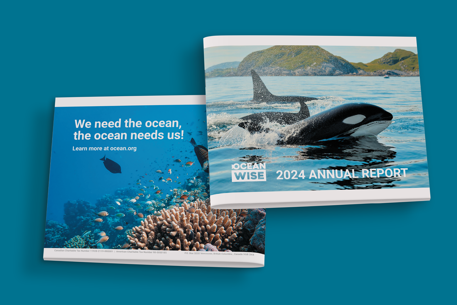
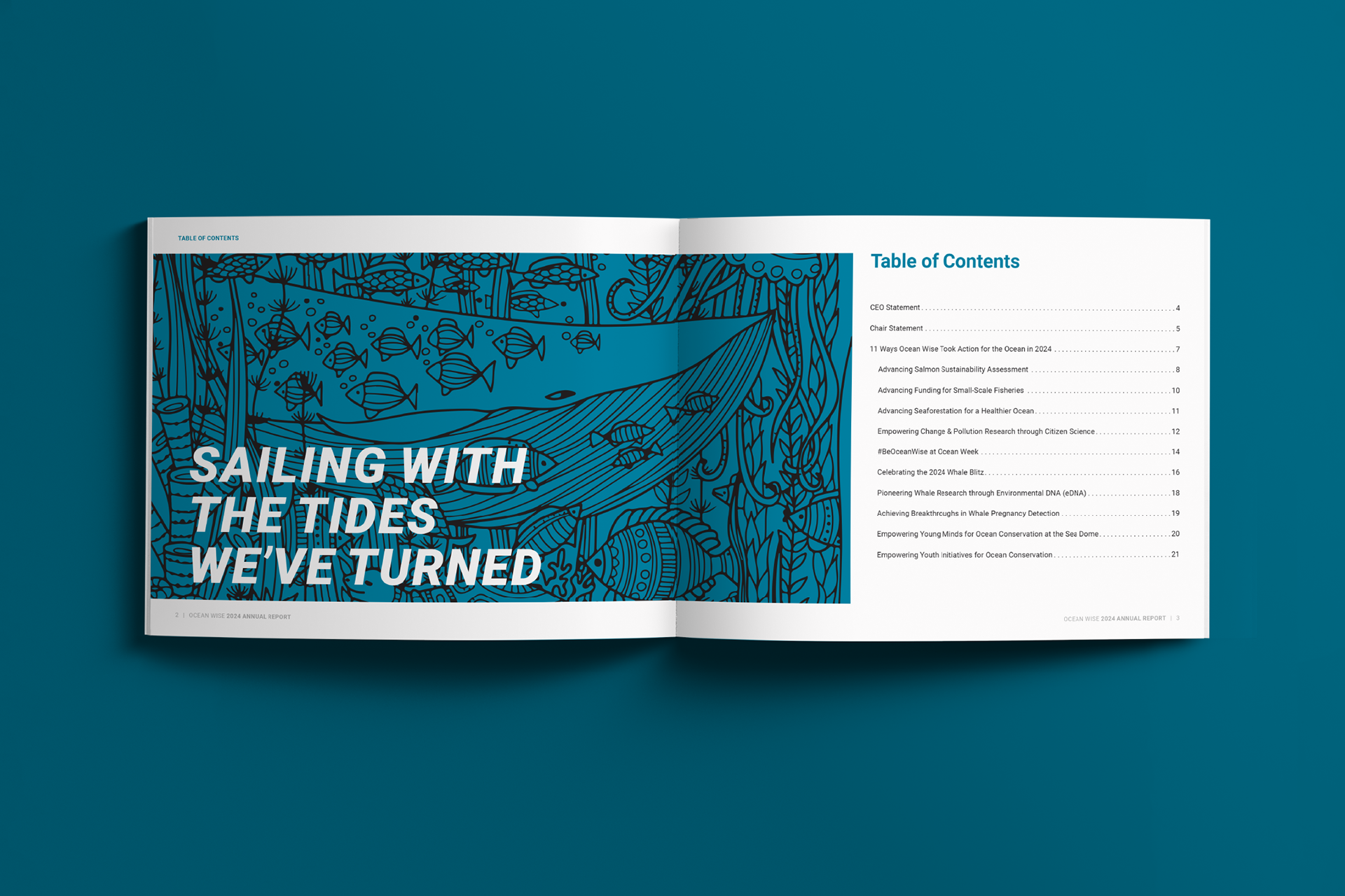
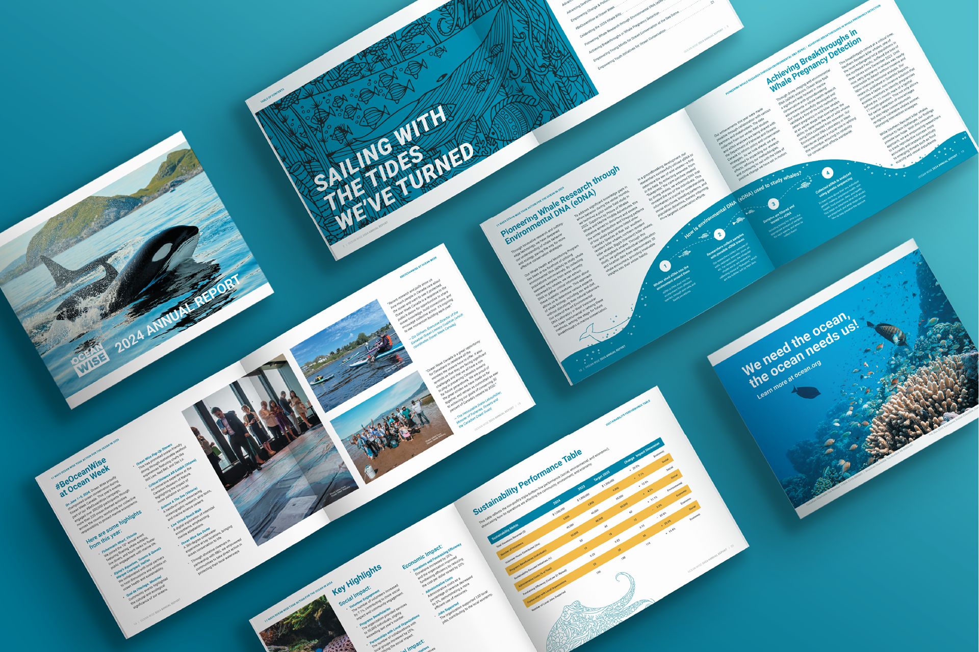
"Sailing with the Tides We've Turned"
This is the theme of the annual report, inspired by the saying reaping what (one) has sewn, I saw 2024 as their breakthrough year in many aspects. They had achieved a milestone in almost every single initiative they have started in the past 2 years, even after being heavily impacted by the pandemic.
Throughout my design process, I stuck to their official Brand Guidelines and the theme; from my file setup in Adobe InDesign, to my choices in imagery, down to the specifics in typography & logo usage.
In areas of design not specified by the Brand Guideline, I searched for previous publications, such as other annual reports and previous publications. If I couldn’t find any reference, I allowed some creative freedom in certain details for legibility, making sure to adhere to any rules put down by the guidelines
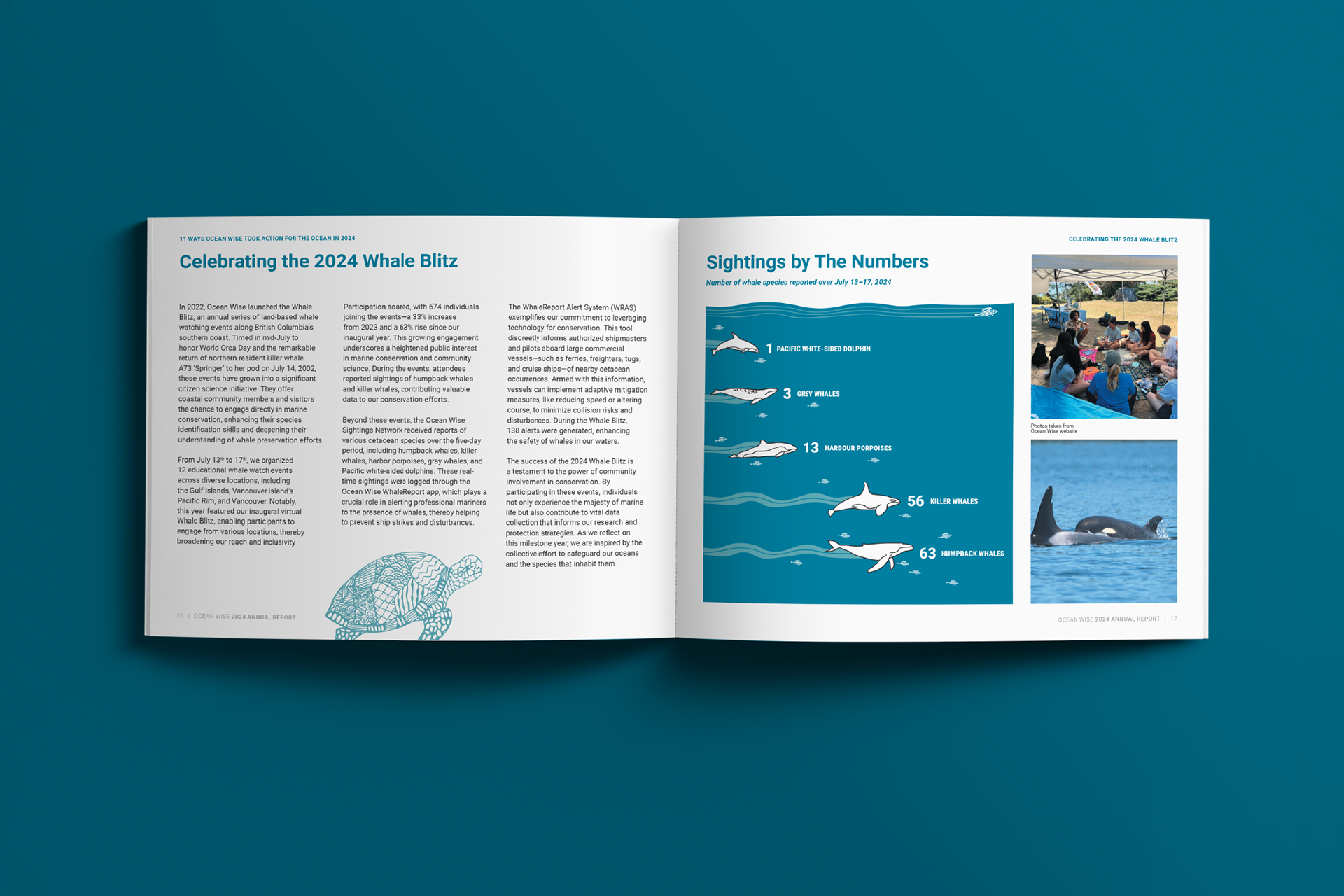
Designing the Graph
I chose to represent information from their official Whale Blitz 2024 Report into a bar graph represented with swimming aquatic mammals. It creates a sense of forward movement and progress, reflecting the tone of the article.
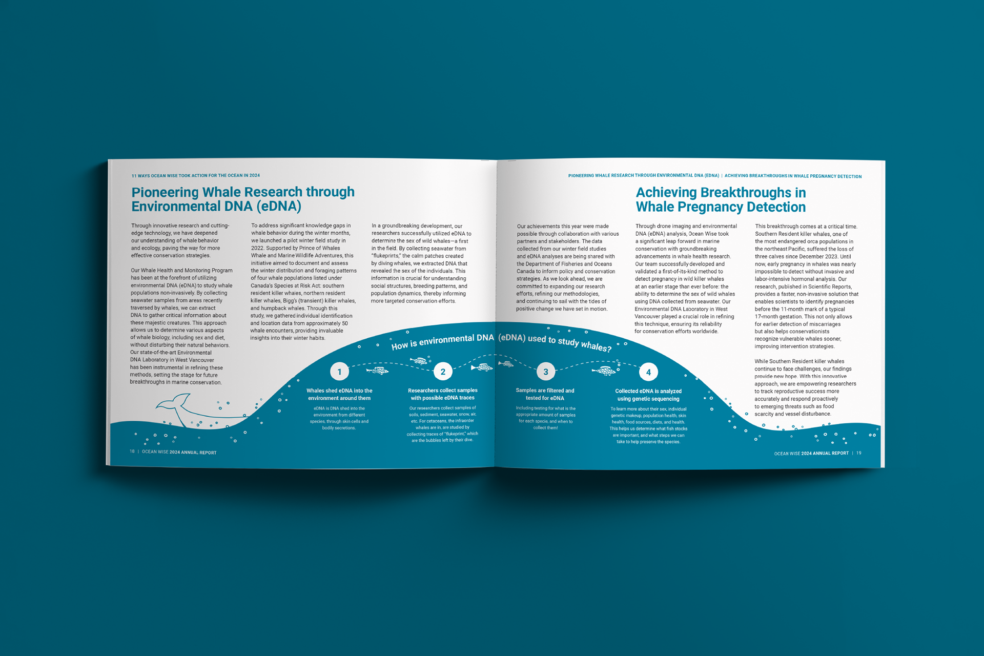
Designing the Infographic
I placed the infographic in a section that I understood would need the most context, as it involved the most scientific method.
I designed the infographic to play with the spacing created by text blocks and the binding for the printed piece, and adapted it to a wave imagery.
I designed the infographic to play with the spacing created by text blocks and the binding for the printed piece, and adapted it to a wave imagery.
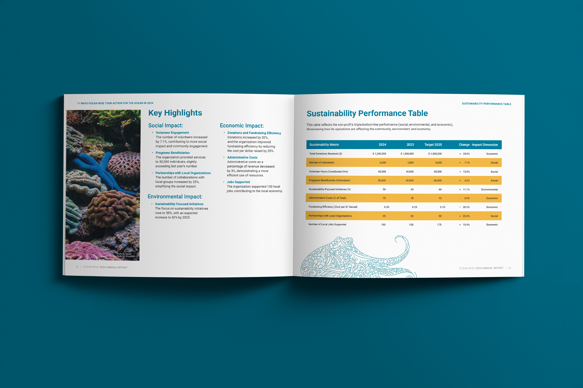
Designing the Table
For the table, I designed this to have a balance of legibility, professionalism, and a touch of optimism, following the theming of the report. I studied the design of financial tables in similar reports and followed a similar formatting.
See the full report here:
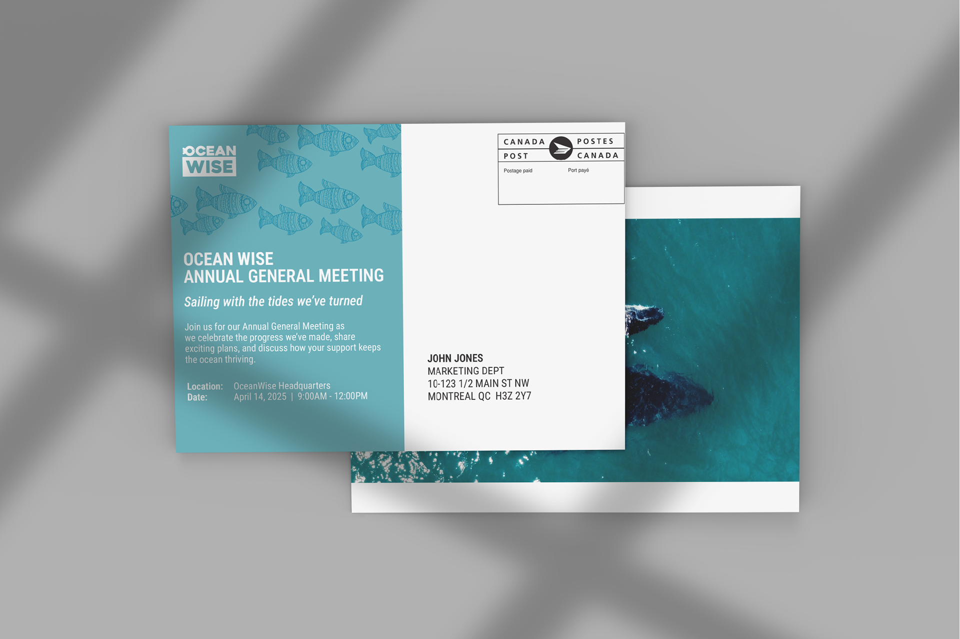
Designing Annual General Meeting Collateral
With an annual report comes an Annual General Meeting (AGM). I designed a postcard to act as an invite for shareholders of Ocean Wise, and the freebies that will be distributed during the AGM.
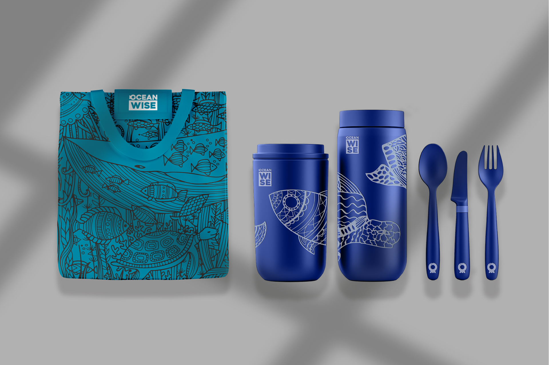
I based my choice of freebies on the Lunchbox Challenge launched by Ocean Wise in 2023. Even though this challenge is no longer continued, I wanted the freebies to serve as a reminder to the participants of the AGM that ocean conservation is not a one-time action, but instead a continuous effort where we adapt our daily lives with better habits for the benefit of the ocean, such as reducing plastic waste by using reusable lunch containers. The containers are decorated with the beautiful illustrations provided by Ocean Wise.
Reflection
This was a very successful, fruitful, and exciting project for the whole way through. It pushed me to balance between being an ambitious designer and a brand-faithful designer – being too ambitious meant I stopped designing to benefit the corporate communications of the company, yet being too brand-faithful meant I was only focusing on structure and habit, which can stifle creativity.
That was alongside designing with the audience of the report in mind, understanding what they would need to better understand the goals and achievements in the company, and how I can help visually “spice” up the report while balancing it with professionalism. I feel like I successfully managed these balances, and really learned a lot as a designer, in understanding what I need to consider in a more corporate environment.