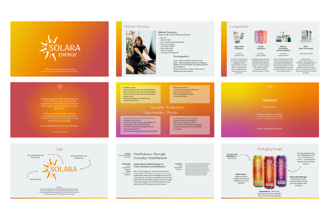
I worked together with a team of 3 other designers to redesign the brand identity and collaterals of an energy drink concept. Our client’s vision was to market a healthy and organic energy drink that doesn’t have the stigma surrounding the more popular energy drinks.
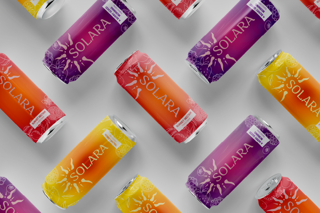
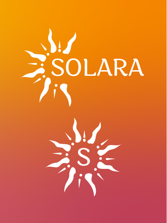
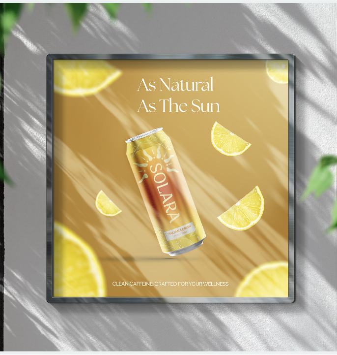
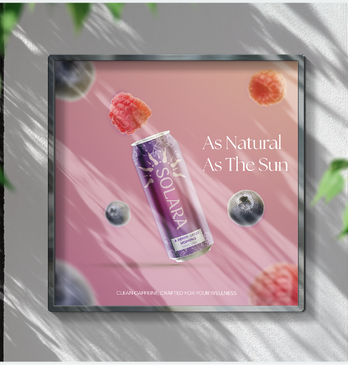
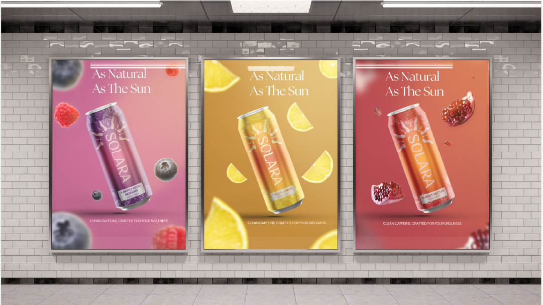
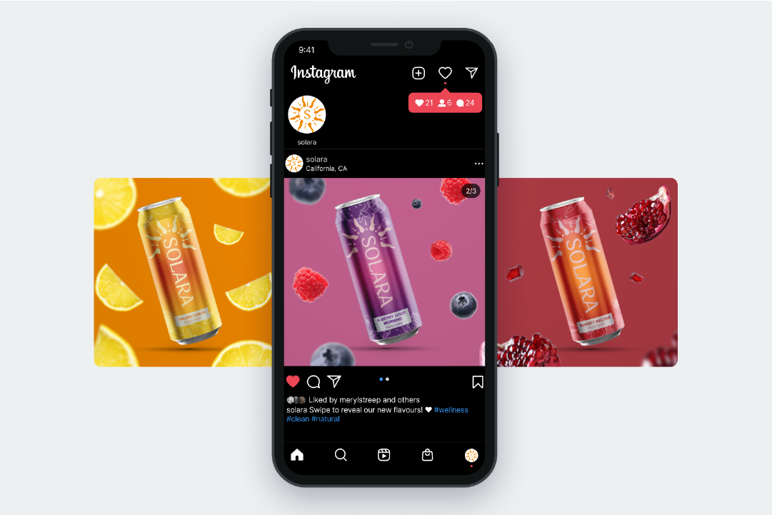
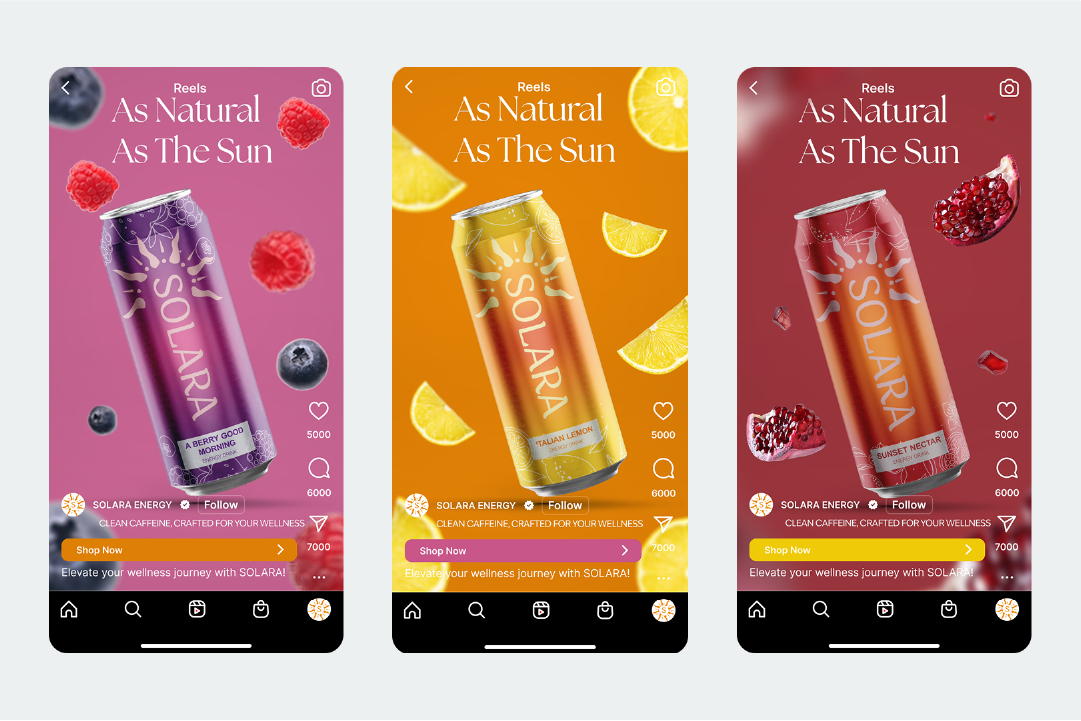
Our team crafted a brand identity revolving around the concept of the natural energizing properties of sunlight; Solara is the drink that energizes you with the natural radiance and vitality of the sun.

My primary role in this project was art direction, copywriting, and industry research. I was in charge of researching the industry landscape and the benefits & risks of various energy drink products. This gave us insights as to the customer expectations of the industry leaders such as Red Bull and Monster Energy, and the values that emerging competitors, such as Erewhon’s products, bring to the table.
As we were all managing multiple projects at the time, I took the initiative to bring the team together to communicate and schedule in-person meetings and online check-ins during our free times, and created milestones for every week to ensure that we make steady progress throughout the weeks. We always made a point to work together towards every milestone so everyone is in the same boat with the brand identity and the design direction. This allowed us time to have feedback cycles with the client, and meet the deadline early with polished results.

The toughest part of the project was agreeing on a product design concept. When we all proposed first drafts, we all had very different ideas expanding from the “sunny” theme, and it was difficult to find middle ground at first. To overcome this without causing tensions, we agreed to continuously iterate designs that take our teammates’ designs as inspiration. We continuously gave each other feedback until we found a design concept that we all agreed was practical, and synergized with the brand image.
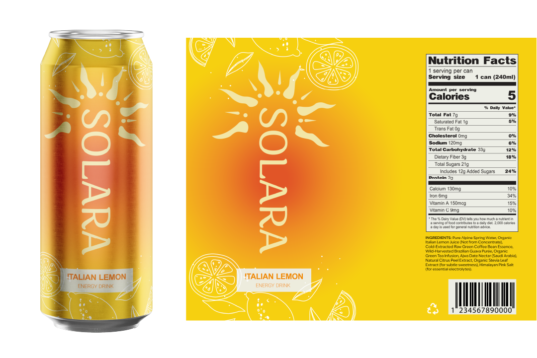
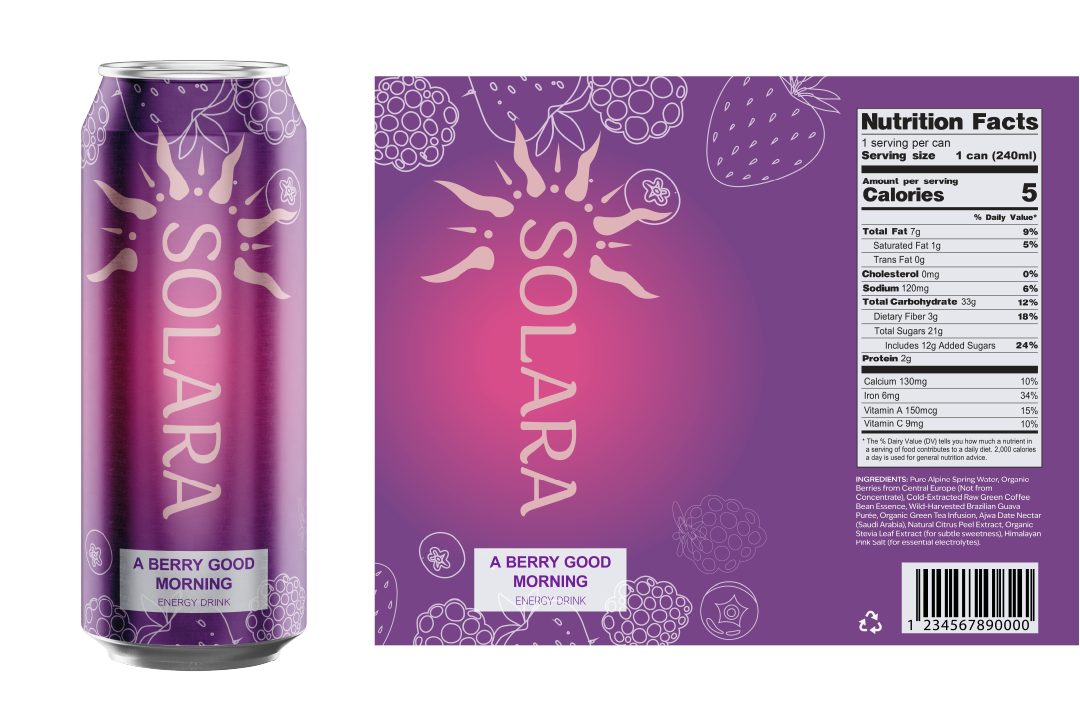
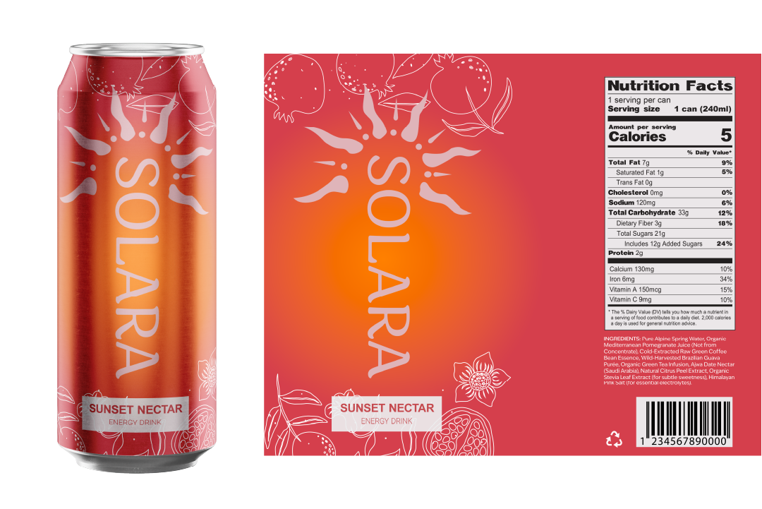
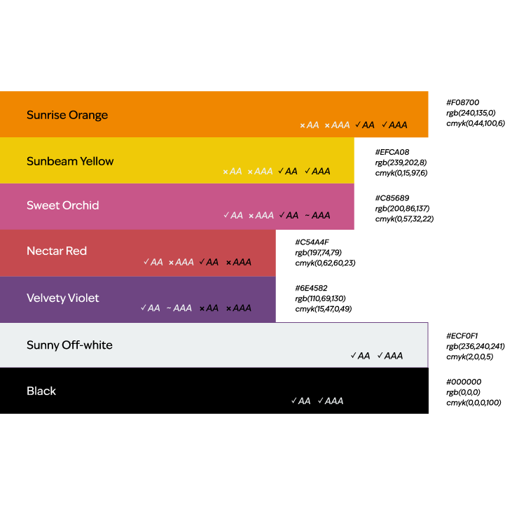
As we neared the end, we split the design work for the final deliverables. I was responsible for the slide deck used to present the project to the client. I used this time to ensure the brand image is consistent, establishing elements such as the color scheme and typography, ensuring to communicate these standards across the team. I directed my teammates focusing on the product designs to better express the brand voice and vision.

Reflection
I believe this was a very successful team project, as our team was able to make the deadline early, with designs we were all very proud of.