I was tasked to design a music festival's brand identity and merchandise based on a niche genre I am particularly interested in: Japanese Indie Folk. It is a subset of Japanese Indie Music that takes elements from traditional Japanese Folk music and combines it with pop and contemporary indie.
I started by deepening my understanding of the genre and its culture. Since this was a niche genre, I looked into the evolution of music in Japan to understand the context of the genre's origin, such as the dark, emotional lyrics about nature and daily life reminiscent of Japanese Folk music.
With this, I found my primary target audience: Japanese men in their 20s, who are the most likely listeners of Japanese indie music. I summarized the genre in 3 keywords as a foundation for my visual language: Simple. Soothing. Idyllic.
Logo
I chose to design a simple logo to express the genre's nature at a glance. This is reminiscent of how the melodies in this genre are usually kept light and airy. This logo consists of a crane and a guitar. In Japanese culture, cranes are symbols of happiness and peace.
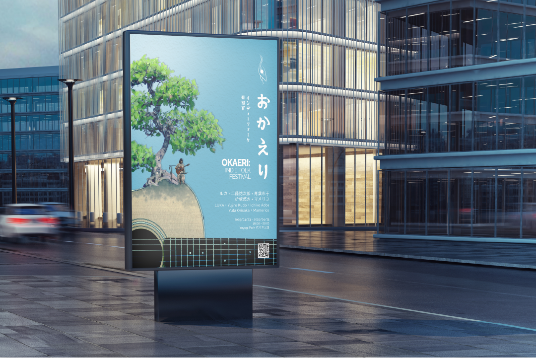
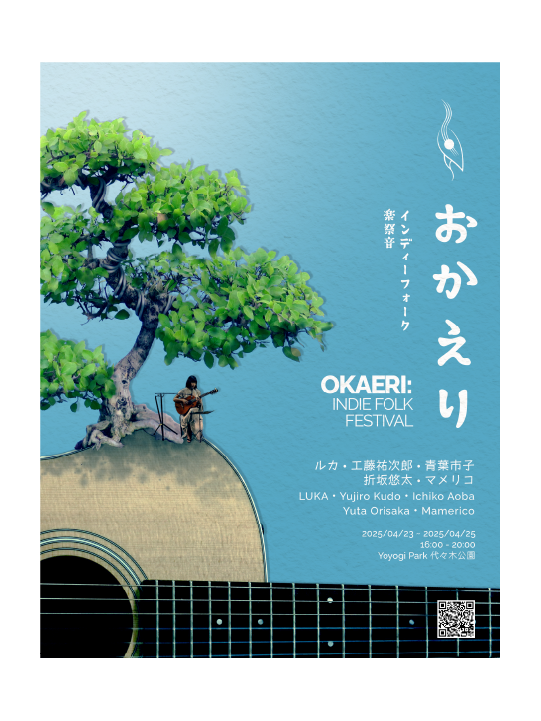
Poster
I began creating the poster for this event using a picture of the countryside to express the feeling of peace that this genre gives. The poster did not come across as a music festival; instead, it looked more like a movie. Switching gears, I followed a simple collage style using imagery that summarized the genre: a guitar, a bonsai tree, and a singer. In my eyes, it was a much more triumphant expression of the genre and functioned as a great starting point for the merchandise.
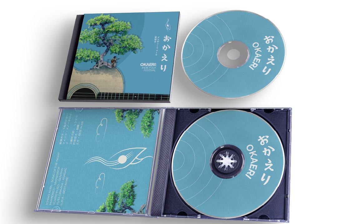
Merchandise
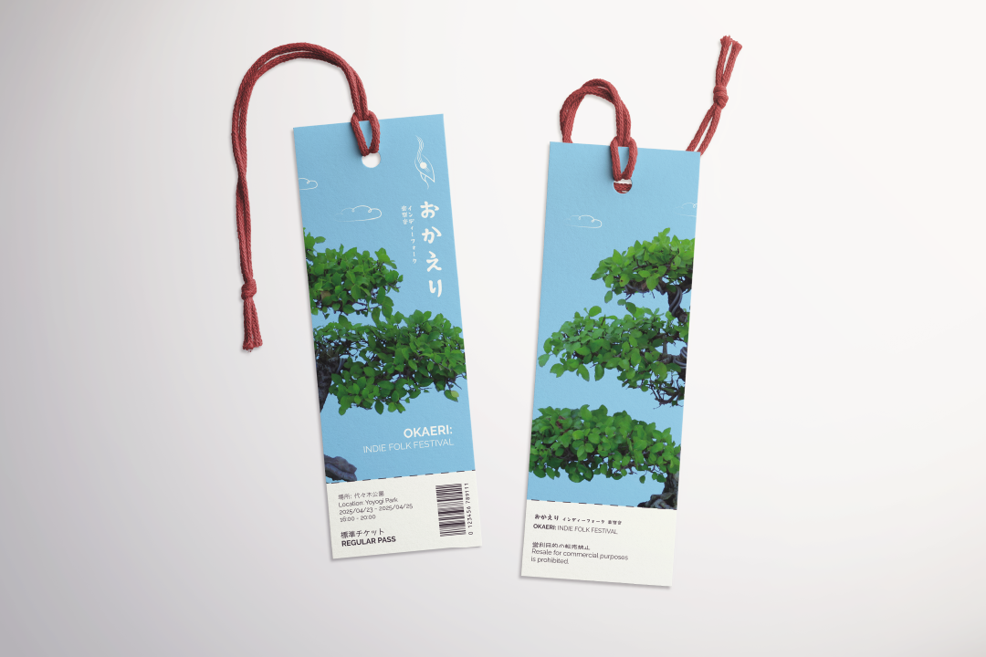
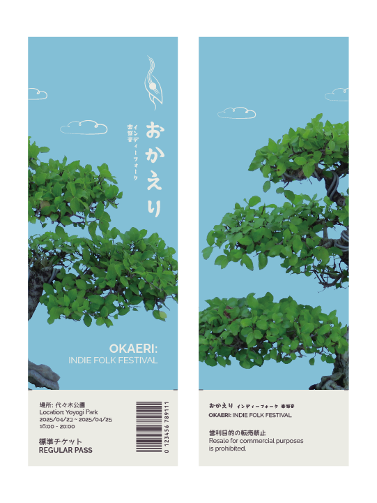
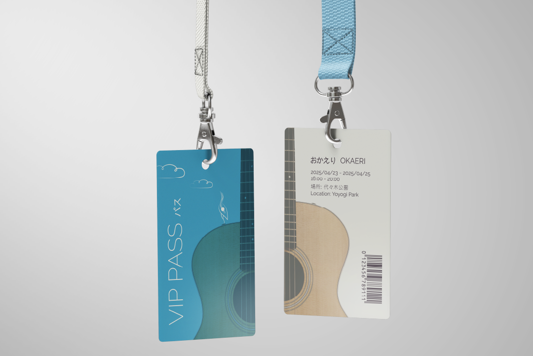
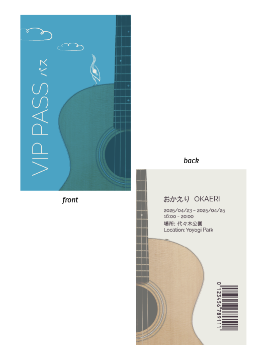
When considering the tickets & merchandise, I thought back to the needs and wants of my target audience. Knowing my target audience is working Japanese men, practical home goods are more valuable to them than cosmetic items. I also found in my research that selling CDs is still prevalent in Japan. Using my knowledge and research, I designed the tickets to be a double use, initially as a ticket with a tear-off, and a bookmark once the ticket has been used, with all the ticket information kept only in the stub to keep the aesthetic integrity of the body of the ticket. With these ideas in mind, I also designed CDs, VIP passes, and chopsticks.
Reflection
Looking back, this was a very insightful project that challenged me to think critically about where and how to apply my skills and toolset, which was quite a different experience from getting specific prompts from assignments.